Slog

News & Arts

The Stranger Suggests

Critics' Best Bets
Music Arts & Food


Line Out

Music & the City
at Night

Thursday, February 19, 2009

Currently Hanging

Posted by on Thu, Feb 19, 2009 at 3:16 PM

No thank you: Beautifully printed, immaculately composed photographs of colorful, abstracted industrial forms. The world has far, far too many of these already.

04281l.jpg
Arthur S. Aubry's Freeman Baler, 17 Sept 2007, c-print, 19 1/4 by 19 1/4 inches

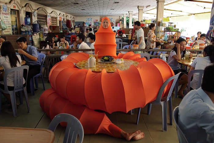
Yes please: Off-kilter photographs taken in places where people want the world to be different from the way it actually is.

04163l.jpg
David Hartt's Local I, Chicago, 55 West Van Buren Street, Chicago, Illinois (2008), chromira prints, each 60 by 48 inches

At Howard House. (Gallery site here.)


Comments (15) RSS

Oldest First Unregistered On Registered On Add a comment
1
Wow. You seriously prefer pictures of an office phone and a mailbox? This explains a lot about your praise for boring-ass art projects.
Posted by The CHZA on February 19, 2009 at 3:19 PM
2
"immaculately composed..." No thank you?

"off kilter..." Yes, please?

Uh... okay. Ah, art world... you are so contrary.
Posted by Paul on February 19, 2009 at 3:28 PM
3
For once we are in complete agreement -- though that's a fairly nice example of the former, and a less than ideal example of the latter. But still.
Posted by Fnarf on February 19, 2009 at 3:29 PM
4
I had the same thought Jen when I saw the show.
Posted by joey on February 19, 2009 at 3:38 PM
5
Well, one could easily argue that the world also has far, far too many of the "off-kilter" photos like the ones you show here. I don't think lack of novelty is a worthwhile criticism these days when so much territory has already been claimed. (Nor is novelty for its own sake a real virtue anymore.) Surely you could think of some more substantive way to pan the Aubry photo.
Posted by yuiop on February 19, 2009 at 3:43 PM
6
I don't get it. It's a corner with a mailbox and bus stop. Why is it off kilter? Why does it indicate a wish for a different world?

Maybe because I grew up in Chicago, it looks perfectly normal.

Although there is an engineering flaw. That looks like the building's air intake. So bus fumes are going to be pulled into the building AC. That's a problem with a lot of buildings-- frequently the intake is next to the loading dock, next to an easily ignored sign that says "don't idle vehicles here".

Was that what you see in the photograph? The inability of the architectural team to deal with engineering realities?
Posted by eclexia on February 19, 2009 at 3:50 PM
7
When I saw the Aubry show I wanted desperately for something to happen. They were all well lit, well composed, but I found the most interesting to be one where a mysterious pool of water broke the symmetry and threatened to rust and contaminate the photo's sterility: http://www.howardhouse.net/artists/aubry…
Posted by boxofbirds on February 19, 2009 at 3:59 PM
8
But concrete industrial forms are still totally cool, right?
Posted by Greg on February 19, 2009 at 4:20 PM
9
More "No thank you" and less "yes please"

Please and thank you,
Joe
Posted by jsteel2005 on February 19, 2009 at 4:25 PM
10
yes, the world needs more photographers who take commonplace images and blow them up huge. Scale makes anything better, right?
I didn't see either show, but of the two, I am leaning toward seeing the abstracted industrial stuff. I think I would be bored by the hartt show. Also, "...taken in places where people want the world to be different from the way it actually is." ???
I think the abstraction photo portrays the world in an idealized light more effectively than plain jane shots of everyday locations. Or do you mean actual, physical locations? Neither interpretation makes too much sense to me.
Posted by seattle bike guy on February 19, 2009 at 4:44 PM
11
I don't know, I like the starkness of the Hartt photos. There's something appealingly austere about them.
Posted by Abby on February 19, 2009 at 4:46 PM
12
I went to the gallery. I agree with Jen, even if I think art criticism is generally retarded.*

*(My own included. Speaking of which... Jen, I'm still not over your defense of that crooked bench. That shit was fucking amateur/lame.)
Posted by Hercules Hipshot on February 19, 2009 at 5:33 PM
13
the aubry photos are pretty but rather one-dimensional.

i'm not really feeling the hartt photo on the left, but i love the colors and geometry of the one on the right. it looks plain and familiar at first (i actually thought it was of the PG&E building downtown san francisco until i read the title), but it becomes more abstract the longer i look at it. it's a similar effect i get from the aubry photos, only this has more depth to it. i like it.
Posted by brandon on February 19, 2009 at 7:03 PM
14
I saw both, and didn't really like either, actually. The Aubry pieces weren't big enough -- they were only a foot and a half across -- and scale is important for those of us who grew up with the huge pieces of machinery over at Gasworks.

And the Hartt works, I thought they were emotionally predictable, and in the same vein as every other staged, gritty, urban, ugly art photo that's been taken in the last five years. They were grimly pessimistic. (Though I found the laconic pessimism of the images to be refreshing when I saw these amidst the inauguration and Obamamania.)
Posted by arts&letters on February 19, 2009 at 11:48 PM
15
Can you change from Currently Hanging to Currently Borning?
Posted by Buckly Hagen on February 26, 2009 at 12:24 PM

Add a comment

Advertisement
 

All contents © Index Newspapers, LLC
1535 11th Ave (Third Floor), Seattle, WA 98122
Contact Info | Privacy Policy | Terms of Use | Takedown Policy